Thursday, September 20, 2018

texture and pattern


texture and pattern

texture- this refers to the tactile qualities of the surface of an object.
pattern- the underlying structure that organises surfaces or structures in a regular pattern.
action of light- light is used to illuminate different parts of a surface, which will accentuate the pattern or texture.


examples of texture
Image result for textureImage result for textureImage result for texture


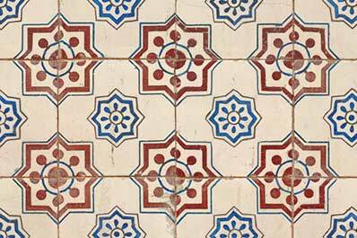
some examples of patterns
Image result for texture


Image result for natural pattern photography


AO1: Develop ideas through sustained and focused investigations informed by contextual and other sources, demonstrating analytical and critical understanding.

from the image bank, i could focus on the texture of the bark and the fabric as they could be quite interesting to photograph. the photos look as they have been taken using a macro lens which is something i could use in my photoshoot.


AO2Explore and select appropriate resources, media, materials, techniques and processes, reviewing and refining ideas as work develops.

the atrist i have chose for my research is Edward Weston. his work takes a close look at the texture and pattern found in common everyday household  objects such as fruit and vegetables. these can be quite interesting to a photographer as they can be so varied, which makes them good to photograph. i think i am going to go down a similar route and photograph different fruits and vegetables with interesting textures. 

i could use different lighting angles and techniques to show the patterns and textures from different perspectives.


artist research

for my first artist i chose Edward Weston. he is an american photographer who passed away in 1958. his work mostly consists of black and white photos of different objects with different textures. the way that each object is positioned and lit, accentuates the texture and pattern of the surface and makes it more abstract as it shows the viewer a close up of an object that may be hard to recognise. he may have chosen to make his photos black and white because it shows the contrast between light and dark.

Image result for edward weston


this photo shows a close up of a mushroom. at first glance, the mushroom may be hard to recognise as it is taken at an angle that is much closer than normal. by doing this and by lighting it from underneath, Weston has brought out the lighter and darker parts of the mushroom which shows the texture and structure of the mushroom. this photo also causes the viewer to pay closer attention to the object, and try and work out what has been used in this image.

Image result for edward weston

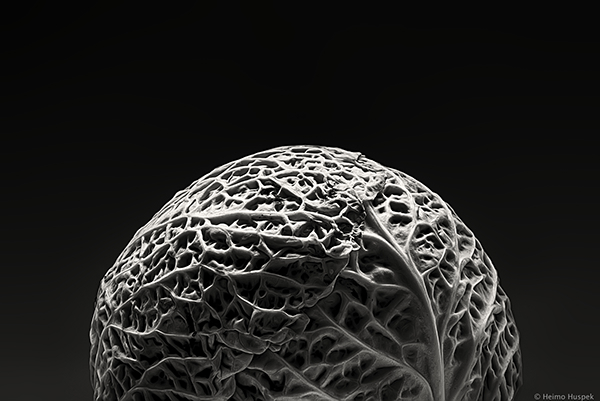
this photo shows a cabbage. it looks as though it has been lit from above. this makes the veins stand out and creates a clearer pattern. while editing this, Weston may have increased the contrast to make the shadows and highlights even more prominent.


for my second artist, i chose Nadege Marieau. this artist uses bright colours to bring out the texture and pattern in her photos.


the photo on the left shows the inside of a pumpkin. the photographer may have chosen to use this because it resembles a cave. the low angle that the photo has been taken from makes the pumpkin seem much bigger and cave like. the bright colours in this photo make it appear more like a fantasy image.

the photo on the right shows a pomegranate. this fruit has very unique texture which is probably why she chose to photograph it in this way. the vibrant colours in this photo are set against a black background which brings them out.


contact sheets


these are some of my best photos from the shoot


AO3: Record ideas, observations and insights relevant to intentions, reflecting critically on work and progress.
my idea when photographing texture was to take photos of things that have a unique and distinct texture, like the Nadege Marieau. however, instead of using bright and vibrant colours, i have edited them so that they appear darker but with a higher contrast which will bring out the texture.

these are some of the photos i edited.


in this photo i adjusted the curves to bring out contrast in the light and dark areas. i also increased the brightness and decreased the saturation until the photo looked how i wanted it.


for this photo i used the hue and saturation settings to create a colder colour scheme. i then used curves and the contrast adjustment to make the raised areas more visible which brought out the texture and pattern of the drain cover.


for this photo, i edited it in a similar way as the others because i wanted to achieve the same effect. by this i mean i used the curves and the contrast to enhance the texture of the shoe and make it stand out.


similar to the others, i also used the contrast and curves to enhance the texture in the stones. this worked quite well because of the multiple light and dark areas in the photo which now really stand out. i also decreased the vibrancy and saturation slightly so that the contrast stood out more.


AO1-  the artists i have researched take photos of objects that have a very prominent texture or pattern on the surface. i chose them because their work is interesting and it makes you look at everyday objects more closely and you notice more than you usually would.

AO2- or this shoot i used a nikon D7100 with a standard zoom lens. this allowed me to zoom in close to the subject of my photo and capture the detail in the surface.  i didn't use a tripod as my shutter speed was at a suitable level and the environment i used in had enough light for the photos to be at a decent quality.

AO4- i believe i have created a meaningful response to my artist. i can clearly see the textures and patterns in the edited photos. however i would like to make them black and white to make the texture and pattern the bigger focus for the photo, aside from the colour which could be distracting to the viewer.


Thursday, September 13, 2018

colour


colour

definition


how something appears as a result of the way it reflects and absorbs light.
primary colour- colours that can be used to create every other colour.
muted colour- colours mixed with black or white to make them appear more dull.
secondary colour- colours made by mixing two of the primary colours
analogous colour-colours that ate next to each other on the colour wheel.
complimentary colour- opposite side of the colour wheel. the contrast between these colours makes them stand out.


colour and emotion

different colours can mean different things and created certain moods when used in a photo or sign. for example, the colour yellow can be used to create a light or happy tone in a photo. however, it is also used as a background on a warning sign to represent danger. yellow is usually mixed with black to create this effect. another example of this is blue. this colour can be used to make something appear sad or dull, however it can also be used to make a photo appear peaceful. green can also show tranquility but has the ability to portray someone as envious or jealous.


in this music video, the colour scheme is very dull which creates a sad or dark mood for the video. as the video gradually moves on, the background slowly gets brighter, which lightens the mood and follows the theme of the song.


image bank
AO1: Develop ideas through sustained and focused investigations informed by contextual and other sources, demonstrating analytical and critical understanding.

for my part of my research, i looked at different music videos and how the colours used in them portray different emotions that are influenced by the song. for example, the Amy Winehouse video uses bright, vibrant colours to show happiness which matches the tempo and sound of the song.


Image result for william egglestonImage result for colour photography

Image result for colour photographyImage result for colour photography

Image result for colour photography

AO2:Explore and select appropriate resources, media, materials, techniques and processes, reviewing and refining ideas as work develops.

the artist i have chosen uses colour as a way of making his photos portray the emotion of the scene. this is something i would like to attempt through my response and see what emotions i can convey through my work.

artist research

for my research, i chose Christopher Eggelston. he was born in 1939 in Memphis Tennessee. his first camera was a canon rangefinder. in the early days of his career, he experimented with different colour transparency film. later on, he was appointed a researcher n colour film at the Massachusetts institute of technology.


here is some of his work

Image result for william eggleston

the photo below shows what looks like a petrol garage. the photo itself looks very saturated
and the colours really stand out. this creates a happy vibe and resembles the 50's, where bright colours were very popular. this photo also reminds me of the summer because of the brightness and the colours and the yellow hue. the photo above has a similar effect. the bright colours in this one really makes the shop fronts stand out and creates an american summer in the 50's vibe.


here are some of the photos that i edited


in this photo i used photoshop to make the flowers more saturated and bright. by using the hue and saturation settings, i could make the colours as bright as i wanted.


i did the same for this photo. the colour blue is much brighter in this photo as i increased the saturation of the blues.


i made this photo black and white by creating a layer on photoshop that desaturates the photo.

the colours in this image have been muted using the curves on Photoshop. by adjusting the curves i could make the colours brighter and darker or increase and decrease the exposure.


AO3: Record ideas, observations and insights relevant to intentions, reflecting critically on work and progress.
my idea for photographing colour, was to focus on complimentary and analogous colours. this is because they stand out and can change the mood of a photo, according to the colour and tone. they can also create interesting effects which i would like to experiment with.


AO4: Present a personal and meaningful response that realises intentions and, where appropriate, makes connections between visual and other elements.

i believe i have created a meaningful response. i am happy with the quality of my photos and the colours found in them. however, i would like to re do this shoot at some point as i want to try and capture different scenes of people and events that i could possibly pick colours from and create emotion. 


when i edited this photo, i wanted to make the colour of the sign and the brick wall less dull. i did this by using the vibrancy and saturation settings. this made the colours slightly brighter and more vibrant.


line


line

a line means a path between two objects. lines can go in all different directions. this could be diagonal, vertical, horizontal and more.

different directions can create different effects.

diagonal line- shows movement and a direction of travel

vertical line- shows power and strength. examples of this includes a cliff face or pillar.

horizontal line- shows calmness and tranquillity.

converging lines- these show depth and scale and distance.
curved or s shaped lines-imply quiet, calm and sensual feeling in the photo.


this photo was taken by Ansel Adams. originally from san francisco, this photographer grew up in a house in the middle of the sand dunes of the golden gate bridge. being an environmentalist, the subjects of his photos normally revolve around nature and landscapes. This photo gives the impression of movement because of the way the roots interwind and cross over each other. the curved lines also create a calm and peaceful tone. i chose this photo because of the illusion of movement which grabs the viewers attention.


Image bank


The following images were added as part of my visual research.


 (AO:1.  here are some visual ideas that i could pursue
Image result for line photography

Image result for line photography

Image result for line photography


above is a collection of photos that i would like to use as part of my research on line. these show some of the ideas i would like to attempt when i complete my first photoshoot.


for my photo shoot, i could use inspiration from the image bank such as the brickwork and the painted lines on the ground.

Selected Images

Contact sheet(s)


(note that the contact sheets were created with Photoshop, you will be shown how to create them)

My Best images (target 4 - 6)


I selected the following as my best images   


Images that require improvement.

(AT LEAST 2 IMAGES)


I chose these photos because i am not as happy with the outcome compared with the other photos from this shoot. although the image above shows line in the way the metal curves, it doesn't show movement, which is what i wanted to get from that photo. if i were to take this photo again, i would take it from the front to fully capture the curves and illusion of movement in the metal. For the photo below, i would take it from a different angle, which would hopefully make the photo lighter and easier to recognise. i would also use a tripod, and get the edge of the photo straight.

AO3: Record ideas, observations and insights relevant to intentions, reflecting critically on work and progress.

my idea when taking these photos was to capture different objects and scenes where lines were prominent, and to experiment with different types such as horizontal, vertical and diagonal lines. this allowed me to see what effects i could create with these lines. 

The images came out as I expected, however I had to pay particular attention to getting the right exposure settings.   


With reference to the Best selected images...
ii chose the above as my best images because the lines in each photo stand out. for example the shoe laces and the lights that were stretched across two buildings. in these images, the lines are what the viewers eye is drawn to.

AO2Explore and select appropriate resources, media, materials, techniques and processes, reviewing and refining ideas as work develops.

for my photoshoot, i chose ansel adams as my inspiration as his work shows lines through many different styles and perspectives.

for this shoot, i used a Nikon D7100 and a standard zoom lens. this worked well as the lens meant i could show more detail and get closer to the subject of my photos.

AO1: Develop ideas through sustained and focused investigations informed by contextual and other sources, demonstrating analytical and critical understanding.


(Here you will discuss how you developed your work based on your research of e.g. artists/photographers, etc).

The artist research was helpful as I realised that the theory on line meant that I could tackle the subject from a range of perspectives.  My research of Walker Evans helped me to focus on the hard geometric shapes of modern cities.  This was helpful to me as the college is located in Harlow where many of the buildings gave me opportunities to photograph geometric shapes.  The research on line and emotion/mood was not particularly helpful to this study, however some of the shots were composed using leading lines where the perspective of the buildings draws the viewer into the composition... this aspect of research was useful. 

(It is important that you show a progression of your work… which may mean revisiting a subject area and adding additional images showing a development of your ideas or refinement of the final images through).

AO4: Present a personal and meaningful response that realises intentions and, where appropriate, makes connections between visual and other elements.  

(At the end of the entry you will discuss whether you have produced a personal and meaningful response, this means  (are my images creative/relevant to the subject area studied/connected and influenced by any research undertaken). 

i believe i have created a meaningful response to Ansel Adams. although the subject matter in each photo doesn't link directly to him, i have edited these photos in the style of my chosen photographer. when editing these photos i used photoshop t make them black and white