colour
definition
primary colour- colours that can be used to create every other colour.
muted colour- colours mixed with black or white to make them appear more dull.
analogous colour-colours that ate next to each other on the colour wheel.
complimentary colour- opposite side of the colour wheel. the contrast between these colours makes them stand out.
colour and emotion
different colours can mean different things and created certain moods when used in a photo or sign. for example, the colour yellow can be used to create a light or happy tone in a photo. however, it is also used as a background on a warning sign to represent danger. yellow is usually mixed with black to create this effect. another example of this is blue. this colour can be used to make something appear sad or dull, however it can also be used to make a photo appear peaceful. green can also show tranquility but has the ability to portray someone as envious or jealous.
in this music video, the colour scheme is very dull which creates a sad or dark mood for the video. as the video gradually moves on, the background slowly gets brighter, which lightens the mood and follows the theme of the song.

image bank
AO1: Develop ideas through sustained and focused investigations informed by contextual and other sources, demonstrating analytical and critical understanding.
for my part of my research, i looked at different music videos and how the colours used in them portray different emotions that are influenced by the song. for example, the Amy Winehouse video uses bright, vibrant colours to show happiness which matches the tempo and sound of the song.


AO2:Explore and select appropriate resources, media, materials, techniques and processes, reviewing and refining ideas as work develops.
the artist i have chosen uses colour as a way of making his photos portray the emotion of the scene. this is something i would like to attempt through my response and see what emotions i can convey through my work.
artist research
for my research, i chose Christopher Eggelston. he was born in 1939 in Memphis Tennessee. his first camera was a canon rangefinder. in the early days of his career, he experimented with different colour transparency film. later on, he was appointed a researcher n colour film at the Massachusetts institute of technology.
here is some of his work


the photo below shows what looks like a petrol garage. the photo itself looks very saturated
and the colours really stand out. this creates a happy vibe and resembles the 50's, where bright colours were very popular. this photo also reminds me of the summer because of the brightness and the colours and the yellow hue. the photo above has a similar effect. the bright colours in this one really makes the shop fronts stand out and creates an american summer in the 50's vibe.
here are some of the photos that i edited


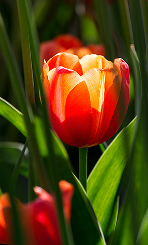
in this photo i used photoshop to make the flowers more saturated and bright. by using the hue and saturation settings, i could make the colours as bright as i wanted.


i did the same for this photo. the colour blue is much brighter in this photo as i increased the saturation of the blues.


i made this photo black and white by creating a layer on photoshop that desaturates the photo.


the colours in this image have been muted using the curves on Photoshop. by adjusting the curves i could make the colours brighter and darker or increase and decrease the exposure.


AO3: Record ideas,
observations and insights relevant to intentions, reflecting critically on work
and progress.
my idea for photographing colour, was to focus on complimentary and analogous colours. this is because they stand out and can change the mood of a photo, according to the colour and tone. they can also create interesting effects which i would like to experiment with.
AO4: Present a personal
and meaningful response that realises intentions and, where appropriate, makes
connections between visual and other elements.
i believe i have created a meaningful response. i am happy with the quality of my photos and the colours found in them. however, i would like to re do this shoot at some point as i want to try and capture different scenes of people and events that i could possibly pick colours from and create emotion.

i believe i have created a meaningful response. i am happy with the quality of my photos and the colours found in them. however, i would like to re do this shoot at some point as i want to try and capture different scenes of people and events that i could possibly pick colours from and create emotion.


when i edited this photo, i wanted to make the colour of the sign and the brick wall less dull. i did this by using the vibrancy and saturation settings. this made the colours slightly brighter and more vibrant.


I would advise that you develop this further by adding shots taken on weekends and photograph more in the style of W. Egglestone, Please ensure that you follow the set structure for creating blogs with AT LEAST four final edited images under AO4 with an analysis.
ReplyDelete